Identity
How we write our name and use our symbols is the closest we come to a signature for Acme Brick. Whether it appears on a job site sign, a product sample, or a digital screen, our identity represents more than a brand — it reflects a century of craftsmanship and trust. Consistency in how our name and symbols appear ensures our customers, partners, and communities can always recognize and rely on the quality behind them.
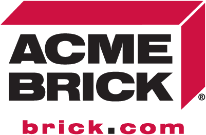
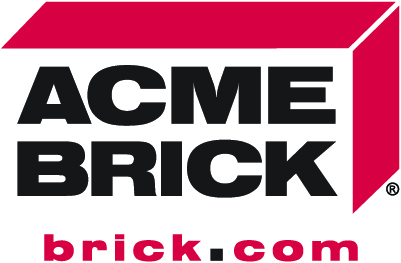
Acme Brick Logotype
Our logotype represents the enduring strength and craftsmanship of the Acme Brick brand. Every letterform is designed to convey precision, stability, and trust — the same qualities that define our products and our people.
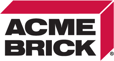
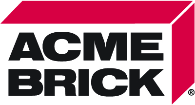
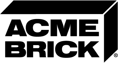
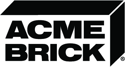
The Acme Brick logo may be used in one of four approved treatments: black type with red brick, white type with red brick, knockout white, or reversed black.
Each version ensures maximum clarity and contrast across a variety of applications, while maintaining the integrity of the Acme Brick identity.
Clear Space
To ensure our logotype remains clear and recognizable, avoid placing any other elements—such as text or graphics—within the designated clear space.
Minimum sizes
The logotype should always be legible. Never use it at sizes smaller than specified.
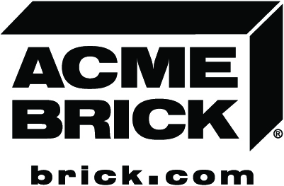
Acme Brick | brick.com Lockup Logotype
Use the Acme Brick with Brick.com logo when the brand stands alone — for example, on signage, digital ads, or any placement with limited space.
This version reinforces brand recognition and connects audiences directly to the primary online destination.
When an ad or asset already includes a specific web address (e.g., brick.com/tulsa), use the Acme Brick logo without the “brick.com” to avoid redundancy.
Both versions may be used interchangeably, but maintaining clarity and balance in each layout should guide the choice.
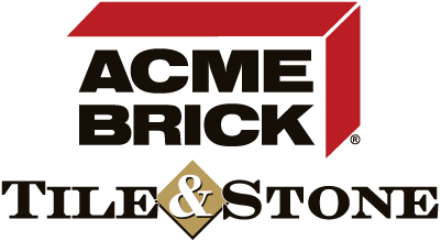
Acme Brick Tile & Stone Lockup Logotype
The Acme Brick Tile & Stone logo is intended for local sales offices and regional marketing.
It’s the preferred mark for community outreach, local sponsorships, or events where the location itself is the focus — such as home shows or charity partnerships.
Individual locations may choose which version best fits their materials, as long as the logo is applied consistently and follows brand usage guidelines.
Acme Brick Red
Core Brand Color
The red used in our logo and brand materials is more than a color — it’s a symbol of the strength, craftsmanship, and heritage that define Acme Brick.
When producing marketing materials, signage, or co-branded assets, it’s important to use our official red to ensure visual consistency and brand integrity.
Vendors and partners should reference the approved color specifications below to match Acme Brick’s official red across digital and print applications.


Nimbus Sans Black Extended
The logotype features Nimbus Sans Black Extended, a bold and timeless typeface chosen for its strength, clarity, and architectural precision—reflecting the enduring quality of Acme Brick.


Acme Fonts
The typefaces listed here are the officially approved fonts for Acme Brick and should be used across all brand communications to maintain consistency and clarity.